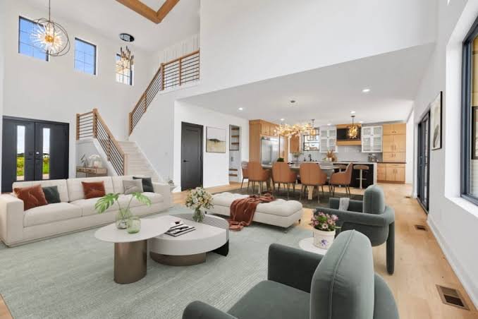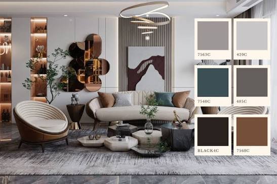
Standing in front of a paint chip wall with 200 shades of “off-white” staring back at you? I’ve been there, and it’s genuinely paralyzing. Learning how to choose interior color palette decisions that actually work together isn’t about picking your favorite individual colors — it’s about understanding how colors behave next to each other, under your specific lighting, in your specific rooms.
I used to pick colors purely based on what looked good on a paint swatch in the store. Bad idea, every time. Store lighting lies. A color that looks warm and inviting under fluorescent showroom lights can look completely different — sometimes unpleasantly so — once it’s on your actual wall at 6 PM with the sun going down.
This guide walks through an actual process, not just a list of trendy color combos, so you end up with a palette that works in your home specifically.
Start With What You Already Have
Before picking any new paint color, look at what’s already fixed in the room — flooring, countertops, large furniture pieces you’re not replacing — since your color palette needs to work with these existing elements, not against them.
This step gets skipped constantly, and it’s honestly the biggest source of regret I see. People fall in love with a color from a magazine or Pinterest board without checking if it actually complements their existing tile, wood flooring, or that sofa they’re not planning to replace anytime soon.
A few things to audit first:
- Flooring — is it warm-toned wood, cool grey tile, or something neutral? This sets a strong undertone constraint for everything else.
- Large furniture — pieces you’re keeping need to work with new wall colors, not clash against them.
- Fixed fixtures — kitchen cabinets, bathroom tile, staircase railings — anything expensive to replace should guide your color choices, not fight them.
Once you know your fixed elements’ undertones (warm or cool), you’ve already narrowed your color options significantly, which honestly makes the rest of this process a lot less overwhelming.
Understand Warm vs Cool Undertones
Every color, even neutrals like white and grey, carries either a warm or cool undertone — warm undertones lean yellow, orange, or red, while cool undertones lean blue, green, or grey, and mixing the two inconsistently is one of the most common reasons a color palette feels “off” without an obvious explanation.
This trips up more people than almost any other part of choosing a palette. Two whites can look completely different side by side — one might read as creamy and warm, the other as stark and slightly blue-grey.
- Warm undertones pair well with wood tones like teak or oak, brass fixtures, and earthy accent colors.
- Cool undertones pair well with grey-washed wood, chrome or nickel fixtures, and jewel-toned or blue-grey accents.
- Testing tip: hold a paint swatch next to a plain white sheet of paper in natural daylight — the undertone becomes much more obvious against a true neutral reference.
I’ve noticed people get frustrated trying to figure out why two “neutral” rooms don’t flow well together, when it’s almost always an undertone mismatch — one room warm, the next room cool, with nothing bridging them.
The 60-30-10 Rule for Balanced Rooms
The 60-30-10 rule is a simple color-balancing guideline: 60% of a room should be a dominant color (usually walls), 30% a secondary color (furniture or large textiles), and 10% an accent color (accessories, art, small decor) — this ratio creates visual balance without any one color overwhelming the space.
It sounds almost too simple, but it genuinely works as a starting framework, especially if you tend to freeze up when facing too many color choices at once.
Here’s how it typically plays out in a living room:
- 60% dominant — your wall color, often a neutral or soft tone that sets the room’s overall mood.
- 30% secondary — your sofa, rug, or curtains, usually a stronger color that supports the dominant tone.
- 10% accent — cushions, art, a vase, small decor pieces where you can experiment with bolder or trendier colors without long-term commitment.
The beauty of this rule is that your 10% accent color is the easiest and cheapest to change later if you get tired of a trend, while your 60% dominant color — the one that costs the most to redo — stays more timeless and neutral.
Choosing Colors Room by Room
Different rooms benefit from different color approaches — bedrooms generally favor calming, muted tones, kitchens and dining areas can handle bolder or warmer colors that stimulate appetite and energy, and living rooms work best with versatile neutrals that support a lot of different activities.
Let’s get specific, because “it depends on the room” isn’t actually useful advice on its own.
- Bedrooms: Soft blues, muted greens, warm greys — colors associated with calm and rest, avoiding anything too energizing or stimulating right before sleep.
- Kitchens: Warmer tones (soft yellows, warm whites, terracotta) tend to feel inviting; some studies suggest reds and oranges can even stimulate appetite, for better or worse depending on your goals.
- Living rooms: Neutral bases (greige, warm white, soft taupe) work well since this room hosts the widest range of activities and needs to feel comfortable at different times of day.
- Bathrooms: Cooler, cleaner tones (soft blues, whites, light greys) tend to feel fresh, though warmer neutrals work too if the rest of your home leans warm.
Picture a small business owner in Jaipur who runs a home-based tailoring studio out of her front room. She specifically chose a warm, energizing terracotta for that space — separate from the cooler, calmer palette in the rest of her home — because she wanted the work area to feel distinct and stimulating rather than blending into the household’s more relaxed color scheme.
How Lighting Affects Your Color Choices
Natural and artificial lighting change how paint colors actually appear on your walls — a color that looks perfect under bright midday sun can look muddy or flat under warm evening bulb light, which is why testing paint samples at different times of day matters more than most people realize.
North-facing rooms (in the northern hemisphere, which includes most of India) tend to get cooler, more consistent light throughout the day, which can make colors appear slightly cooler and more muted than they do in a paint store. South-facing rooms get warmer, more direct light, which can intensify colors and make them appear brighter or more saturated than expected.
A few practical steps:
- Paint a sample patch directly on your wall — not just on a cardboard swatch — since the actual wall texture and surrounding light affect perception.
- Check the sample at three points in the day: morning, afternoon, and evening with artificial lights on.
- Look at the sample from different spots in the room, not just standing directly in front of it.
Has this ever happened to you — a paint color that looked perfect in the store and completely different once it dried on your actual wall? Lighting is almost always the culprit, and it’s the single best reason to always test before committing to full gallons.
Building a Cohesive Palette Across Multiple Rooms
A cohesive whole-home color palette doesn’t mean every room uses the same color — it means rooms share a consistent undertone (warm or cool) and a limited overall color family, so moving between spaces feels intentional rather than jarring.
You don’t need matching walls throughout your home. That would honestly feel a bit flat and monotonous. What you do need is some kind of visual thread connecting spaces, especially ones that are visible from each other, like an open kitchen-living area or a hallway connecting multiple rooms.
- Pick 2-3 core neutral tones that repeat across connected spaces (walls, trim, or larger furniture pieces).
- Let each room have its own accent color, but keep those accents within a consistent overall undertone.
- Transition spaces — hallways, staircases — work well in a neutral that bridges the colors on either side, rather than introducing a completely new tone.
[link to guide on best paint finishes for different rooms here]
I’ll admit, I once painted every room in my apartment a completely different, unrelated color scheme, purely because I loved each one individually. Walking from room to room felt jarring, honestly a bit chaotic. Lesson learned the expensive way — individual color love doesn’t guarantee they work as a whole-home palette.
Tools and Resources for Testing Color Combinations
Peel-and-stick paint samples and small sample pots are far more reliable for testing an interior color palette than relying on paint chips alone, since they let you see actual color behavior on your wall under your specific lighting conditions before committing to full cans.
A few practical resources worth using:
- Sample pots — most paint brands sell small 200ml sample tins specifically for testing before committing to a full purchase; genuinely worth the small extra cost.
- Peel-and-stick swatches — larger than a paint chip, removable, and useful for testing multiple spots in a room without commitment.
- Color palette apps — many paint brands now offer apps that let you visualize colors on uploaded photos of your actual room, though take these with a grain of salt since screen colors never perfectly match real paint.
- Physical material samples — if you’re also choosing flooring or countertops alongside paint, get physical samples of those too, since screen and swatch colors rarely translate perfectly.
[link to related guide on exterior house painting costs and best practices here]
Don’t skip the physical sample step to save time. It’s genuinely one of the cheapest insurance policies against an expensive repainting mistake down the line.
FAQs
How many colors should be in a home’s interior color palette? Most designers recommend sticking to 3-5 core colors across a home — typically 2-3 neutrals plus 1-2 accent colors — to keep the space cohesive without feeling either boring or chaotic.
What’s the easiest color palette for beginners to work with? A neutral-based palette (whites, warm greys, soft beiges) with one or two accent colors is generally the safest and easiest starting point, since neutrals are forgiving and pair well with almost anything.
Should every room in my house be the same color? No, that’s not necessary and can actually feel monotonous — what matters more is that rooms share a consistent undertone and a limited overall color family, not identical wall colors throughout.
How do I know if a color has a warm or cool undertone? Hold the paint swatch next to a plain white sheet of paper in natural daylight; warm undertones will read slightly yellow, orange, or pink, while cool undertones will read slightly blue, green, or grey.
Does room size affect which colors I should choose? Yes, to some degree — lighter colors tend to make small rooms feel more open, while darker, richer colors can make larger rooms feel cozier and more intimate, though this isn’t an absolute rule.
How long should I test a paint sample before committing to the full room? At least a few days, ideally covering different weather conditions and times of day, so you can see how the color behaves under both natural and artificial lighting before painting the entire space.
Conclusion
Figuring out how to choose interior color palette decisions that actually work isn’t about chasing trends or picking your favorite individual shades — it’s about understanding your fixed elements, respecting warm versus cool undertones, and testing colors properly under your home’s actual lighting before committing. The 60-30-10 rule gives you a solid starting framework, and building consistency across rooms (without demanding uniformity) keeps your whole home feeling cohesive.
Before you buy a single gallon, grab a few sample pots, paint some real patches on your actual walls, and live with them for a few days. It’s a small extra step that saves you from repainting an entire room a few months later because the color looked completely different than you expected.